On March 16, 2017, the NBA filed an application to register a copyright in the Magic logo and, on April 6, 2017, filed applications to register copyright in the Pistons and Spurs logos.
Initial rejection: In October 30, 2017 letters, a Copyright Office registration specialist refused to register the claims, finding that the logos lacked originality. The NBA appealed to the Copyright Office Review Board and argued that the three logos meet the originality threshold because they are unique designs and not mere typographic ornamentations and that the logos comprise more than common and familiar shapes and mere letters.
Appeal: On the NBA’s second motion for reconsideration, the Board agreed with the NBA on the originality of the Pistons and Magic logos because they contained sufficient creativity, but the Board denied the registration of the Spurs logo. The question in registering a copyright in a logo is whether the combination of the elements is protectable. The Board noted: “A mere simplistic arrangement of non-protectable elements does not demonstrate the level of creativity necessary to warrant protection. For example, the United States District Court for the Southern District of New York upheld the Copyright Office’s refusal to register simple designs consisting of two linked letter ‘C’ shapes ‘facing each other in a mirrored relationship” and two unlinked letter ‘C’ shapes “in a mirrored relationship and positioned perpendicular to the linked elements.'” (emphasis added).
In making this determination, the Board does not consider “the attractiveness of a design, the espoused intentions of the author, the design’s visual effect or its symbolism, the time and effort it took to create, or the design’s commercial success in the marketplace are not factors in determining whether a design is copyrightable. See, e.g., Bleistein v. Donaldson Lithographing Co., 188 U.S. 239 (1903).”
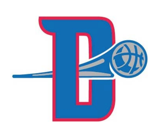
The Detroit Pistons Logo
The Board found sufficient creativity in the Pistons logo for the following reasons:
- The combination of the letter “D” and various geometric shapes featuring numerous colors and shading exhibits sufficient creativity.
- The elements interact with one another in a singular manner; for example, the basketball passes through the letter “D,” as emphasized by the wedge shape to the left of the basketball illustrating movement.
- The basketball and wedge shapes also feature stylized shading, which courts have considered a significant element in demonstrating originality.
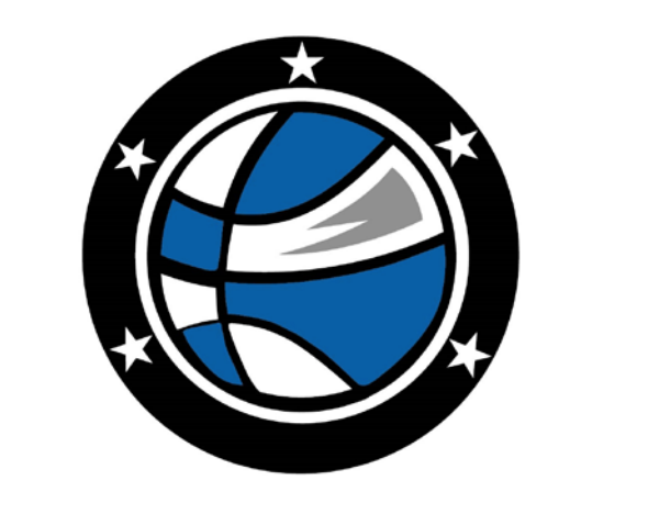
The Orlando Magic Logo
The Board found sufficient originality in the Magic logo for the following reasons:
- The Magic logo features four colors and, as in Nicholls and Prince Group, shading on the basketball, which adds three- dimensionality to the artwork.
- The basketball is surrounded by a double border in black and white that incorporates numerous star designs, an arrangement that is not common or intuitive.
The design of the Magic logo is still relatively simple, and therefore the Board cautioned the NBA that the resulting copyright would be thin and would only protect the NBA from virtually identical copying.
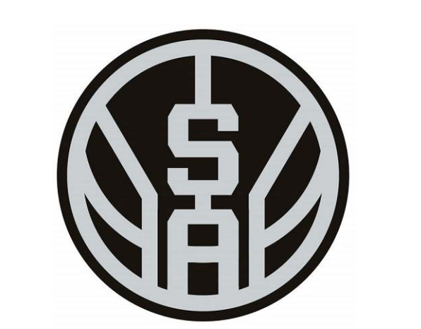
The San Antonio Spurs Logo
However, the Board affirmed the refusal to register the copyright claim in the Spurs logo for the following reasons:
- The placement of the lines on the basketball merely conforms to the size of the circle and helps to create the standard appearance of a basketball.
- The arrangement of the “S” and “A” – unprotectable in themselves – also corresponds to the dictates of the basketball shape and design.
- The minimal color scheme of black and gray does not add sufficient creativity to the design.
We can expect the NBA to appeal the Board’s decision in federal court. The NBA is likely to take another shot at the issue of originality. Whether the fine distinctions the Copyright Board made in distinguishing the Spurs logo as unoriginal from the other two logos will likely be the subject of litigation.
by Adam Grodman, Chicago-Kent Center for Design, Law & Technology fellow


